Sep 16

Another terrible structured product!!!

Its been a little while since I took a close look at some of the structured products that are out there…they’ve been a little unpopular due to their poor general track record over the GFC period, although in their defence they did what they promised, its just very few actually knew what they promised! Anyway, I digress.

A few years ago I posted a review of a particular structured product, criticising it for using a wrong formula…to this day it is the most viewed post on this blog due to many disgruntled investors searching for some answers…but I digress again…

Once again…ANOTHER product with exactly the same mathematical error has emerged. A client (thanks G) sent me the product asking me to have a look and given it is another volatility-linked structured product…the first thing I look at is the volatility formula…which is…

InStreet Masti Formulae

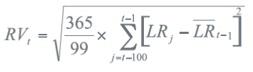
Now I know this doesn’t mean a single thing to anyone reading this post so I’ll cut to the chase…this formula is wrong!!! RV is Realised volatility and is calculated by annualising the volatility of the last 100 trading days…annualising is done by multiplying the daily volatility by the square root of 365. However, because there are around 252 trading days in a year, the annualised volatility should multiply the daily volatility by the square root of 252…not 365 so the result is that the structured product’s volatility calculates to be more than 20% higher than it should….and guess what?!…because the participation rate of the underlying index just so happens to be the lesser of 1.5 or 0.15/RV, it means the higher the volatility the lower your participation rate of the index  and therefore the lower the returns….so investors are misled with a lower than expected return due to a small print error that only people familiar with mathematical volatility formulae know.

Oh yeah…my other favourite part of this product (excuse my sarcasm) is the fact that the underlying index is a price index…so dividends are excluded (and they have to be as derivatives are always structured on price indices)…so investors who believe they are getting exposure to a full sharemarket index aren’t at all and this is a further drag on the expectedreturn of the product.

So investors are receiving the return that is linked to an incorrect volatility formula and a less than complete sharemarket index.

Instreet Masti Series 30 & 31… products that are bound to disappoint!

   Send article as PDF   

Aug 28

What is the Risk Free asset?

This question is probably only important when establishing a base-line return expectation before we accept various type of investment risk.

I guess we all know that technically there is no such thing as a Risk Free Asset but generally speaking it is widely believed that Cash is the risk free asset. Whilst I’m prepared to accept that when the investment timeframe is unknown, Cash is probably quite a reasonable proxy for the Risk Free Asset.

BUT, when we know the investment timeframe then cash is far from a risk free asset as throughout that timeframe interest rates may drop resulting in a lower than hoped return or perhaps inflation can rise faster than the cash rate resulting in a negative real return…hence both of these examples show why cash can be far from risk-free.

If we do know the timeframe then we can adjust our risk–free return expectations one of two ways.

The first way is to simply choose the Government Bond yield over that timeframe. For example, if an investors timeframe is 5 years the current yield for a 5 year government bond is around 3%…so for the 5 year investor the risk-free rate is 3%. that is because if we hold the bond for 5 years we are guaranteed a 3% return and no less. Some could argue that a 5 year bank deposit is also risk-free because it is backed by the government but between now and the next 5 years, the government could always change its mind so it a little riskier than risk-free…but its not bad.

The second way is using government inflation linked bonds over the specific timeframe. In my mind Government Inflation Linked bonds are truly the closest to a risk-free investment because not only do you receive a guaranteed income from the government over a specific timeframe, but the value of your spending dollar is not diminished by higher inflation…unlike our cash example above. In Australia, the shortest inflation linked bond has a term to maturity of around 7 years and it is offering a real return of a little over 1.3% at the time of writing. That compares to a 7 year nominal bond paying around 3.15%pa so inflation only has to be roughly more than 1.85%pa over the next 5 years to break even and if inflation is higher than it works out to be a better deal. From a retiree’s perspective, inflation can be quite damaging to a portfolio so safely hedging this risk with a guaranteed return is quite attractive.

As you would expect, inflation linked bonds do have significantly longer maturities and are less frequently issued than traditional bonds but if you want low risk, and want to hedge inflation over a long timeframe, then inflation linked government bonds are the closest thing to risk free and are the forgotten benchmark of long term investing.

   Send article as PDF   

Aug 24

Some outsourced thoughts on Bernanke

   Send article as PDF   

Aug 15

RimSec August Research Update

I can’t believe its four weeks since my last post so obviously its been a terribly busy period. Anyway, something I have completed is a market/economic update and if anyone’s interested you can download it here.

The update is probably consistent with what is being said everywhere…but either way…

  • The mining investment boom is over and the RBA has decreased to a record low 2.5% to aid the economy moving forward
  • The lower Australian dollar will help the economy, and should balance inflation in the face of a weaker labour market
  • Markets believe another rate cut will occur by the end of the year
  • The global economy is growing but not at strong levels
  • Low interest rates for a long time so reduce your investment return expectations…particularly as assets get expensive as the chase for yield continues
  • There’s bound to be an increase in risky asset volatility when Bernanke does finally begin to taper QE3 so don’t invest outside your risk tolerance


   Send article as PDF   

Jul 18

Surely the top Australian managers are “value” style…well, no!

Australian Value Premium 2012-13Source: Delta Research & Advisory

The above chart shows the performance of the value risk factor, which is simply calculated as the performance of the MSCI Australian Value index minus the performance of the MSCI Australian Growth index. With an ending value great than 15% than the starting value, clearly the 2013 financial year was a great year if your style was “value” biased. When you consider the “chase for yield” theme given low interest rates, this should be unsurprising as the MSCI Value index contains a strong bias towards high dividend paying stocks. So if you bought the ASX200 index you would have received a little more than 22% for the year to June 2013, plus if you were 100% long the value index and shorted the growth index you would have received another 15% to provide a stellar return of 37%…so it probably makes sense that the best performing Australian share managers of 2013 financial year probably had this value bias…surprisingly that’s not necessarily the case.

Top Value Managers 2012-13

Source: Delta Research & Advisory

The above chart shows the managers who are most exposed to “value”. Each line represents their rolling 3 year utility to the value premium and what is most interesting is…

  • The Lazard funds, Hyperion Growth (they may need to rename), and to a lesser degree Perpetual Ethical all rode the value wave until May and reduced their exposure to value which was excellent timing as the value premium went backwards over the last 2 months of the financial year.
  • Hyperion doesn’t appear to be a value manager necessarily but the shape of its Value exposure appears to be well-timed compared to the pure performance of the value premium as they both accelerated from January.
  • Not surprisingly the Antares Dividend Builder has the highest exposure to Value…but its exposure was not diminished over May and June and that would have really hurt it…in fact it lost more than 8% in May alone…ouch!

Top Growth Managers 2012-13

Source: Delta Research & Advisory

The remaining funds (or at least the ones with sufficient performance history assuming I could get it…so nothing on Tyndall, sorry Luke, or UBS Halo, short timeframe there) don’t really have a strong value bias at all. Despite a different title to the second chart in this post, the final chart shows more of a growth bias (Bennelong) or no bias at all (everyone else). These are the funds that have really relied on their stockpicking skills, luck, or other drivers of performance as their style bias has not helped at all.

The surprising results here include…

  • Just because its Perpetual doesn’t mean it  has a “value” style
  • the fact that more of the top funds do not have a “value” bias despite a cracker of a “value” year
  • quite a few of these funds appeared to have sold off their “value” holdings similar to Lazard and Hyperion

To be honest I’m not really sure what I’ve learnt from this analysis so i’ll leave it to you to decide.

Anyway my disclaimer once again is, under no circumstances am I recommending or not recommending any of the above-mentioned investments to the reader. Their recent strong performance could easily reverse as could their above-mentioned styles. If you do choose to invest in any of these funds and they don’t work out…don’t blame me!!!

   Send article as PDF   

Jul 18

Past performance is no indication of…

Top Aust Share Funds - AFR - July 2013


Source: Australian Financial Review

The above table was published in yesterday’s Australian Financial Review (the sourced link takes you there but you may need a subscription) and Lazard Select Equity is the top performer over the last 12 months, and from the other funds in this table, its number one over the past 3 years too. So I thought I’d have a look to see how Lazard’s alpha (or market risk and style-adjusted skill/outperformance) has really been over time.

So…as the below chart shows, Lazard has had some significant bouts of tough times and its numbers have only really looked great over the last 6 months. In fact, if you delve deeply…and I don’t have the charts available for posting yet…it is only the last 6 months performance that have truly contributed to high returns…not that there’s anything wrong (or necessarily right) with that.

One final positive (or negative depending on your view) for Lazard and a personal observation based on my analysis…its Select fund appears to have taken on the most idiosyncratic risk (or is prepared to move furthest away from the S&P/ASX200) of every fund in the list. So it definitely takes the biggest bets and they’ve finally paid off this year. Also, with the exception of the Wavestone Long/Short fund, Lazard Select also has had the lowest exposure to the market (i.e. low beta) which is quite interesting as high beta has been an absolute winner over the past 12 months…and you only have to look at the performance of some of the geared share funds as evidence to that point. So without talking to Lazard, I’m pretty confident they make big bets and those big bets have worked this year…but will they continue??? Who knows.

Lazard Rolling Alpha


Source: Delta Research & Advisory

More analysis to come of this interesting table.

I probably should put a disclaimer in…no personal circumstances have been considered in conducting this analysis and under no circumstances am I recommending or not recommending Lazard funds…this is simple factual analysis and not much more…oh yeah…obviously past performance does equal future performance!

   Send article as PDF   

Jul 12

Hedge Funds…not for the retail investor

Bloomberg Hedge Fund Cover

Source: Businessweek

Plus their fees just make it hurt just that much more.


   Send article as PDF   

Jul 12

A fascinating correlation…and why the Aussie dollar may have declined

10-3 Bond Spread vs US Dollar   Source: Delta Research & Advisory, RBA

Firstly the red line represents the US dollar/Aussie Dollar (RH Axis), so as the chart shows the US Dollar has strengthened since around the middle of April (so you can ignore the AUD label). The other line is the difference in yield (or spread) between the Australian 10 year Government Bond and 3 Year Government bond and as you can see…in 2013 they are very well correlated.

So what does it mean? Well its often dangerous to associate causation from correlation but I’m prepared to say the Aussie dollar’s decline is a result of a shift out of the Aussie longer term bonds..i.e.a reduction in duration risk back to US dollar cash risk.

Its not just a reduction of risk in general…whilst the sharemarket has been shaky over the past few months, it doesn’t have anywhere near the correlation and its decline and volatility started in the final week of May, well after the increase in US Dollar and 10yr to 3Yr Spread. As the following hart shows, whilst there has been some correlation between the Australian sharemarket and the strength of the US dollar, there was a breakdown in correlation between Bernanke’s 22 May congress testimony hinting at stopping QE3 and his mid June statement calming markets about it. The following chart pretty much supports that.

AUD vs ASX


Source: Delta Research & Advisory, RBA


So whilst the start of the decline of the Aussie did coincide with the RBA reducing its cash rate, I tend to think a reduction in duration risk (or sell off of longer term bonds) by US investors….which is the opposite strategy you would undertake if you thought rates were going lower (everywhere that is)….is the unusual but contributing reason for the why the Aussie dollar has gone down.

   Send article as PDF   

Jul 12

RIMSec July Research Report

It has certainly been a while since I posted and, no, this blog is still active and hopefully I’ll be able to produce some good stuff sooner than later. Lots of analysis done, some interesting stuff too, just need the time to write it up. Anyway, I digress…

I’ve just finished a short little Research paper for Rim Securities and if anyone’s interested it can be downloaded here. The report contains my thoughts on markets and the RBA actions which is pretty simple really…I believe

  • Australian economy is weakening such that 25bps is coming off the RBA cash rate next month,
  • Aussie dollar is the current key for the Australian economy and should stay relatively low (compared to the last 12 months),
  • Bernanke’s comments have possibly put risky markets more or less back on their trajectory pre-22 May, BUT
  • Bernanke’s comments can be brutal on risky markets as the 10% correction in the 3 weeks from 22 May showed…oh yeah, Bernanke stopped the correction with his media release saying he’s not stopping the money print!…so don’t overexpose to risky assets in case he changes his mind!

Anyway, happy for any feedback and I hope its worthy.

   Send article as PDF   

Jun 14

To find alpha, first define it

A couple of months ago I presented at a Portfolio Construction Academy forum of around 70 financial planners and researchers about constructing investment portfolios and fund manager assessment using risk factors. From what I can tell the session went quite well and much to my relief the feedback was quite positive.

Following the presentation I was interviewed by James Dunn, finance journalist and “Editor-at-Large” for Portfolio Construction Forum, about the basic risk factors everyone has in their portfolios…alpha and beta (or skill and market risk). Last week the article was published for the Portfolio Construction Forum and assuming you can access it (not sure if a login and password is required) you can find it by clicking here. If you need a login…get one…Portfolio Construction Forum is a great investment resource (disclosure….I get nothing for this plug).

Some of the key points that are quite well explained include…

  • alpha is risk-adjusted outperformance not outperformance alone
  • alpha is often beta in disguise…for example, leveraging an Aussie shares index fund over the last 12 months would have outperformed the index…but there’s no skill (or alpha) in that
  • if you think your portfolio has the equivalent of x% in Aussie and global shares…be careful not to load too much on small cap, property, or emerging markets as your true market exposure (or beta) maybe much greater than x%

Anyway, I have no intention of expanding the above points as the article does a pretty good job.

   Send article as PDF   

Older posts «

» Newer posts

Follow

Get every new post on this blog delivered to your Inbox.

Join other followers: