Diversification is one of the central tenets of investment management and fundamental beliefs across the global financial planning industry. Its validity was set in stone by Harry Markowitz in his PhD dissertation and 1952 Journal of Finance article, Portfolio Selection, which demonstrated the effects of combining uncorrelated assets … i.e. improvement in the portfolio’s return per unit risk. This showed diversification to be the closest thing to the Holy Grail of investing and possibly the only “free lunch” (Rebalancing may be the free dessert) as it was possible to improve the return expectation of a portfolio without necessarily increasing risk (or vice versa … maintaining the expected return whilst decreasing risk).
Whilst, today, the concept of diversification may seem second nature to all of us in the investment industry, some of its fundamentals are often misused and sometimes misrepresented. Diversification is probably the most commonly used justification for investment recommendations and the word carries a sense of lower risk which is always appealing. Unfortunately some of its use appears to have shifted from Modern Portfolio Theory (MPT) definitions, originated by Markowitz, William Sharpe, et al., towards potentially misleading ways which may confuse.
The purpose of this article is to return to some of the (forgotten?) foundations of diversification, and hopefully address potential misconceptions or misunderstandings.
A simple example
It is not uncommon for investment advisers to recommend a portfolio that improves an investor’s existing portfolio on the basis of greater diversification. A simple example may be the investor who has a lot of their wealth tied up in a single stock, maybe because of an employee share scheme or inheritance, etc. The adviser would be concerned about the concentration risk of this single stock and would recommend a sell-down or reduced exposure to the stock to spread its risk across a portfolio of managed funds or perhaps a larger stock portfolio. The justification is the greater diversification because risk has been reduced away from the single stock to a broader portfolio and this has not necessarily compromised return potential.
This may be quite a valid recommendation with a valid justification. Spreading the risk from one stock to many others is a simple example of diversification but there is a little more to this than meets the eye…
Measuring Diversification
Modern Portfolio Theory (MPT) defines the completely diversified portfolio as the Market Portfolio. Without going into too much explanatory detail, because the Market Portfolio contains all assets, the market cannot be diversified away (except, by other markets). So increasing diversification is an exercise in shifting a portfolio to be more market-like. In the “simple example” this was a shift from the specific risk of one stock to many more stocks.
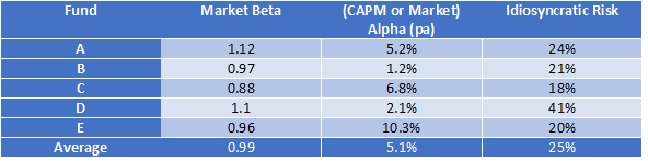
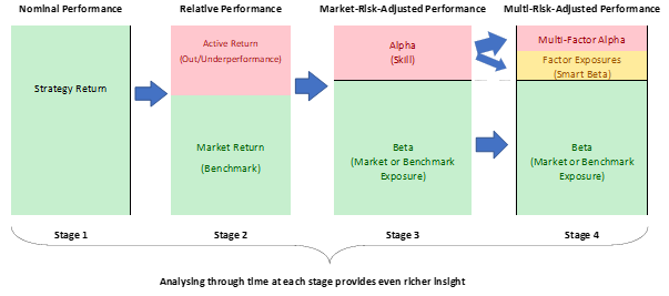
This all means that to measure the level of diversification of a portfolio, consistent with MPT, means it should be measured in the context of the market or market risk. Measures commonly used include active share, tracking error, or systematic risk as defined by the R-Squared of the Capital Asset Pricing Model (CAPM).
Using the CAPM R-Squared measure, an index portfolio is close to 100% market risk, and active strategies will have variable market risk depending on how active and how diversified or concentrated they intend to be. The active strategy’s obvious goal is to ensure that non-market risk produces excess risk-adjusted returns (“Alpha”), but they will always have less diversification than the market.
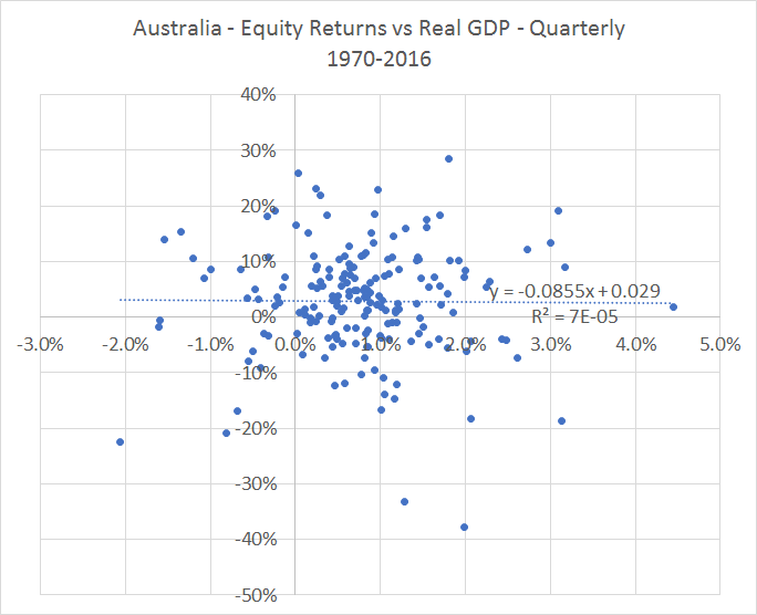
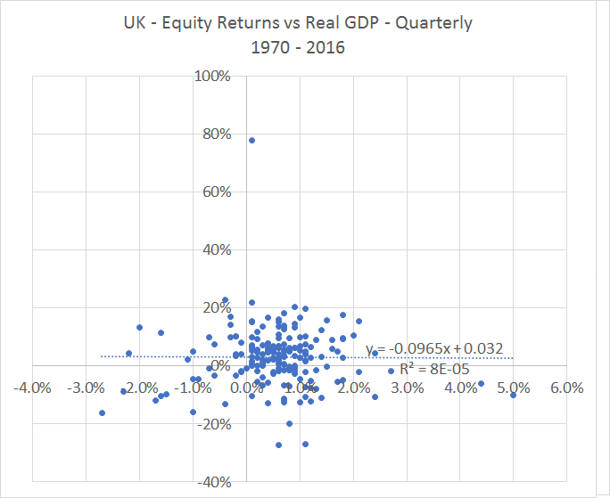
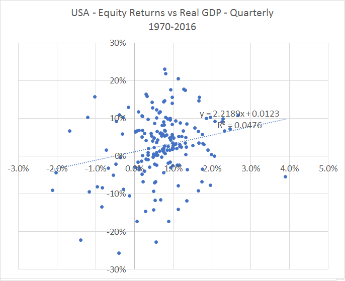
As examples, the following three charts show the market (blue) and non-market risk (green) through time (using Markowitz defined risk) for:
- an Australian Equities index fund
- Popular actively managed Australian Equities fund, and
- Popular actively managed small-cap Australian Equities fund

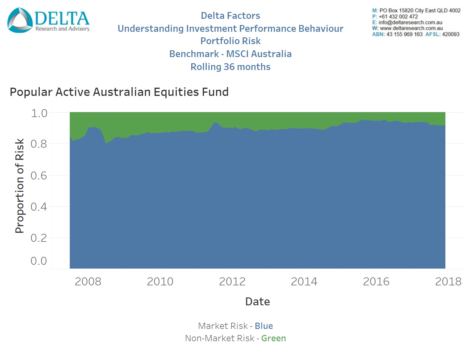
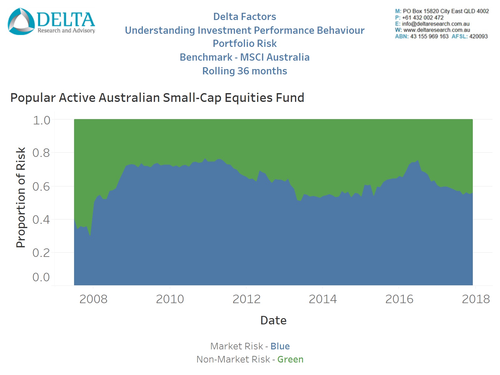
Source: Delta Research & Advisory
The index fund, as expected, is all blue and therefore all market risk; the active strategy is dominated by market risk but with a substantial proportion of non-market risk (sometimes called active or idiosyncratic risk), and the restricted Small Cap strategy, expectedly, has an even higher proportion of green (or non-market risk) as it excludes the large-cap stocks from the market.
So when recommending changes based on diversification, it is possible to explicitly measure and demonstrate the changes and/or improvement in diversification using past performance risk measures.
Diversification Misrepresented
Many may argue that investment recommendations are sometimes looking to diversify away specific risks, as opposed to non-market risks, which may not result in the portfolio becoming more market-like. A popular example, is where an adviser recommends a Small Cap Australian Equities strategy to diversify away the large cap bias of the Australian equities market which is dominated by large banks and materials companies. Whilst, on the surface, this justification appears reasonable there are some issues of which advisers need to be aware.
Firstly, this is not diversification, but is actually the opposite.
Considering the first step of portfolio construction is Asset Allocation, which is designed based on market expectations of asset classes (i.e. “Beta”), a recommendation of a small companies strategy restricts the portfolio and therefore increases concentration risks to small caps and away from the market (or beta) recommendation. This shift away from the asset allocation decision potentially increases risks of market relative performance failure (i.e. compared to recommended asset allocation). Don’t forget, complete diversification contains all assets, which the restricted small cap strategy cannot.
The decision to move away from the market, dominated by large caps, is an active decision which is likely to carry the belief that small caps are likely to outperform large caps, so it is a decision designed to outperform the market and generate “Alpha Risk” (similar to tracking error) and therefore not based on diversification. Diversification is actually “Alpha Risk” minimisation. A portfolio that contains a single security is the simplest example of a massive “Alpha” bet whilst an index portfolio contains no “Alpha” bet whatsoever.
Alternatives
For the last 10 to 15 years, Alternatives have made appearances in more and more investment portfolios and often for reasons of diversification. Sometimes this is true and sometimes not. Alternatives can bring diversification benefits to a portfolio by accessing markets that do not exist within a portfolio. This may be true of soft and hard commodities, private equity, and maybe unlisted infrastructure. This is because these asset classes, or markets, are not represented in the traditional asset allocation of bonds and equities. “A market cannot be diversified away”, except by a different market.
Where Alternatives do not diversify but actually increase concentration or non-market risk, is for the various equity and bond strategies executed by many hedge funds. This includes long-short, variable beta, and potentially other arbitrage or concentrated strategies. Including these strategies does not increase diversification, as it is always possible these strategies have the same market exposure as an index fund, but increases the concentration risks linked to the success or otherwise of the specific strategy bets. Like the small cap recommendation, the inclusion of equity or bond “alternatives” is a recommendation based on capturing manager skill (Alpha) and ability to outperform a market and not one based on improving diversification and minimising non-market performance risk.
Quick word on Over-Diversification
Overdiversification is often mentioned amongst investment circles and in a cost-free world isn’t possible. Overdiversification occurs, when the costs of adding securities or investments to a portfolio detract from performance potential due to these costs. When costs are nil or very low, overdiversification is difficult or impossible to achieve.
For example, a portfolio of many index funds for the same asset class will only be detrimental to portfolio returns compared to one index fund if there are flat fees charged per investment. There is no overdiversification because there is no non-market risk to diversify and the return, irrespective of the number of funds, will be the market minus the average of the low management fees. Diversification and return impact is likely to be minimal … although there is rarely any value in having multiple index funds (of the same market).
Overdiversification most frequently occurs when combining active managers of the same asset class. This is because the more active managers in a portfolio, the more they diversify away the portfolio’s non-market risk (because you can’t diversify away market risk), potentially leaving a portfolio that resembles an index fund but at active manager costs. Measuring this is possible using historical data as already discussed and shown with Figures 1 through 3, but predicting the optimal number of strategies is difficult and can vary depending on how active and correlated each strategy is.
Final Thoughts
It seems diversification is used to justify more than it should. Diversification is a free lunch but only in the context of the market portfolio. It ceases to be free when concentration and greater specific risks are introduced. Diversification is a relative concept and is about reducing non-market risks and not increasing market outperformance potential.
There is no right or wrong level of diversification as there are many schools of thought and examples with reasonable evidence as to what works in markets and what doesn’t. Warren Buffet is quoted as saying that “Diversification is ignorance” and yet recommends most should invest in index funds. Lower levels of diversification may be safest when investment skill exists, but finding true skill is difficult, sometimes expensive, and persistent skill is rare.
Investment recommendations are designed to reflect one’s investment philosophy which help an investor achieve their financial goals. If you believe markets are efficient, you have defined the appropriate level of diversification, and will recommend market portfolios. If not, the portfolio construction question to be answered is, how much diversification is enough?
Bibliography
Markowitz, Harry. 1951. “Portfolio Selection”, Journal of Finance 7, no 1 (March): 77-91
Gary P. Brinson, L. Randolph Hood, and Gilbert L. Beebower. 1986. “Determinants of Portfolio Performance”, The Financial Analysts Journal, July/August
Sharpe, William. 1964. “Capital Asset Prices: A Theory of Market Equilibrium under Conditions of Risk”. Journal of Finance 19, no 3 (September): 425:442
Reilly, Frank K & Keith C Brown. 2009. “Investment Analysis and Portfolio Management – Ninth Edition”. South-Western Cengage Learning


 Source: