

Background
When disappointing performance occurs, alarm bells will typically ring in the minds of investors, advisers, asset consultants and perhaps the managers themselves. Investing has only ever been a long game but thanks to the internet, the 24-hour news cycle, social media, etc. etc., it appears that success is expected to occur quickly and this is the case with investing too. Investors have such an enormous selection menu and if one strategy doesn’t appear to be working out then it’s not difficult to find another … and this has been exacerbated with the reduction of transaction costs.
Investment performance has 2 major problems:
- Analysis timeframes are too short
- Only performance (or benchmark relative performance) is observed
Pure investment performance (or benchmark-relative performance) on a day by day, month by month and even year by year basis is mostly noise and therefore a somewhat redundant analysis exercise. Different styles, risks, industries, sectors, and markets, constantly go in and out of favour and the analysis of performance over these short timeframes is typically a waste of time that can lead to high transaction costs and potentially even worse performance.
The purpose of this article is a simple one. It takes a back-to-basics approach of performance analysis and demonstrates, using a simple case study, one approach of how to cut through the noise to find the signal.
The signal defines what is really happening. The signal is the bigger picture investment view that enables us to undertake better investment analysis, and therefore construct better investment portfolios.
The Short of it
The goal of our case study is to analyse two actively managed Australian equity strategies, renamed to Blue Fund and Orange Fund, to determine their respective suitability for an investment portfolio.
Some quick simple statistics of each fund to begin with…average monthly return and volatility (i.e. standard deviation) over the same time period used in Chart 1 shows the best performer is the Blue Fund, followed by the benchmark, and then the Orange Fund. Low volatility is typically preferred and despite performance volatility has the same order, somewhat counter to the old adage that higher return requires higher risk.
Based on this simple return analysis many would already say that the Blue fund is the superior fund based on the higher level of return per unit of volatility (similar to Sharpe Ratio). However, it is essential to know that Table 1 also suggests that the average monthly returns are not statistically different between both funds and MSCI Australia GR due to the high levels of volatility.
Table 1
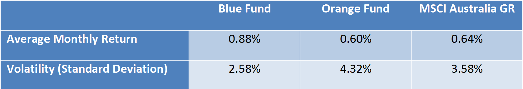
Source: Delta Research & Advisory; MSCI
This statistical lack of difference between returns is supported by Chart 1 which shows the monthly excess returns of each strategy compared to the MSCI Australia GR index. There is no pattern whatsoever and no one data point is likely t be predictable of the future. Sometimes the Blue fund outperforms the Orange fund and vice versa, and they both outperform the index at different times and vice versa. Thanks to the short time period used for this analysis, i.e. Monthly, this chart provides little to nothing and is a very good demonstration of noise with no obvious sign of a signal.
Chart 1 – Monthly Excess Returns
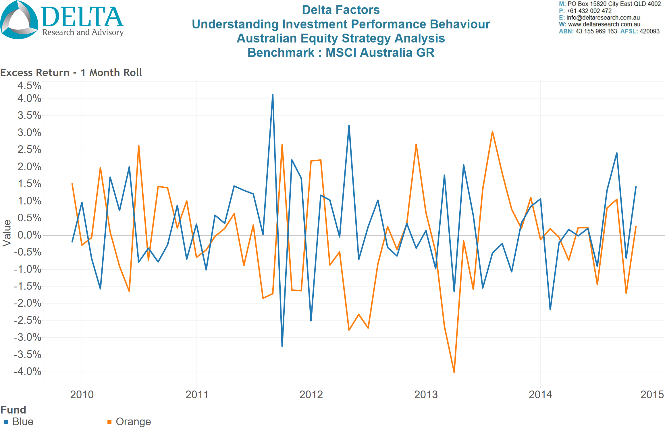
Source: Delta Research & Advisory
A Little Longer
The next step in this analysis progression is to increase the period of analysis for each time series data point from monthly to 6 monthly rolling and then 3 year rolling periods. Six months is a common time period used between client portfolio reviews and Chart 2 shows substantial volatility of these 6 monthly excess returns and therefore reasonable evidence alone that any one six-monthly period should not be used to make an investment decision based on performance…and I’m sure that never happens. Six monthly rolling average appears to show no signal for these two funds individually, so the search for a meaningful signal continues.
Chart 2 – 6 Monthly Rolling Average (Annualised) – Excess Returns
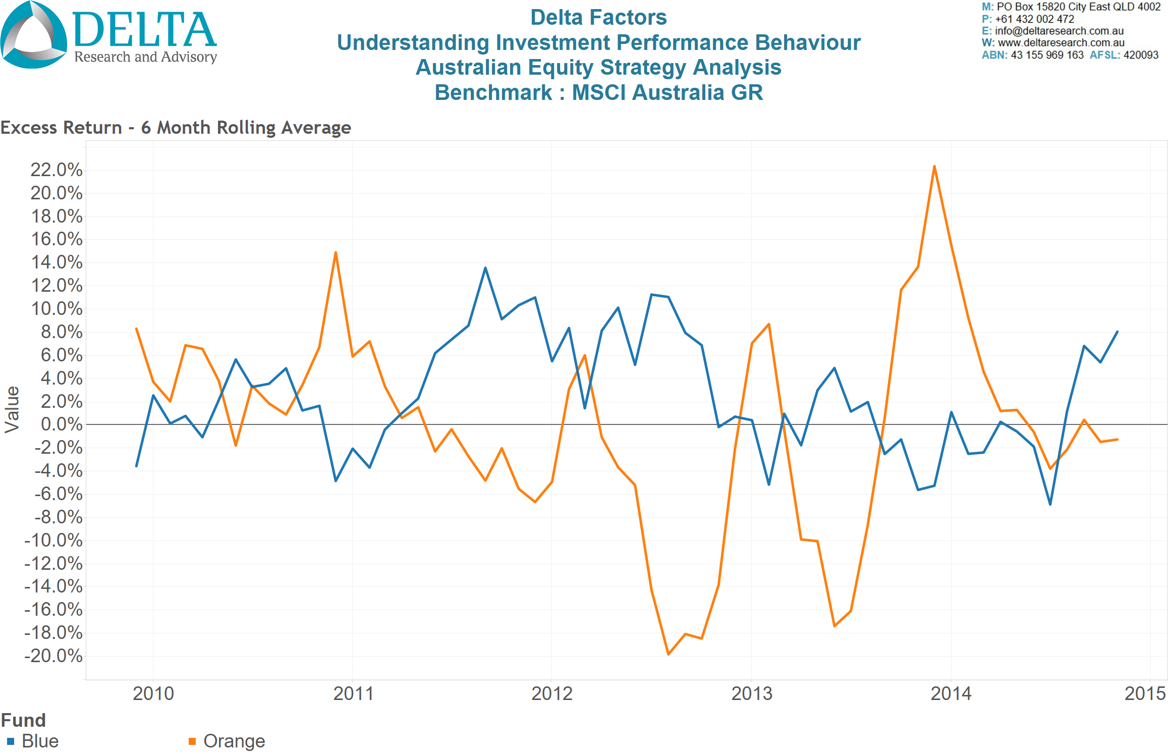 Source: Delta Research & Advisory
On the other hand, potentially there is a signal from Chart 2 which includes timing differences between the Orange and Blue fund’s excess returns. That is, there does appear to be signs where their respective excess returns are moving in opposite directions, plus there are potential signs of the Orange Fund showing more extreme levels of outperformance or underperformance … however, at this point in the analysis these extreme levels should probably be taken with a grain of salt as it has only happened a few times … may be just good or bad luck???
So, moving from monthly returns to rolling 6 monthly rolling returns (Annualised), has yielded some potential insights but nothing conclusive.
Chart 3, takes the moving average of excess returns out to 3 years and the signals are getting a little stronger. The Orange fund has been a consistent underperformer on rolling 3 year periods since the middle of this time frame.
Anecdotally, 3 years is a popular timeframe for analysis and appears to be the amount of time investors and advisers are prepared to sustain underperformance of any one strategy before changing. The fact the Orange fund has had sustained underperformance over much longer than 3 years suggests that many investors or advisers may have excluded this fund from their consideration set or removed it from portfolios altogether.
However, the Blue Fund is looking very impressive, given very consistent rolling 3-year outperformance through almost the total timeframe so is looking to be the better strategy … or is it?
Chart 3 – 3 Year Rolling Average (Annualised) – Excess Return
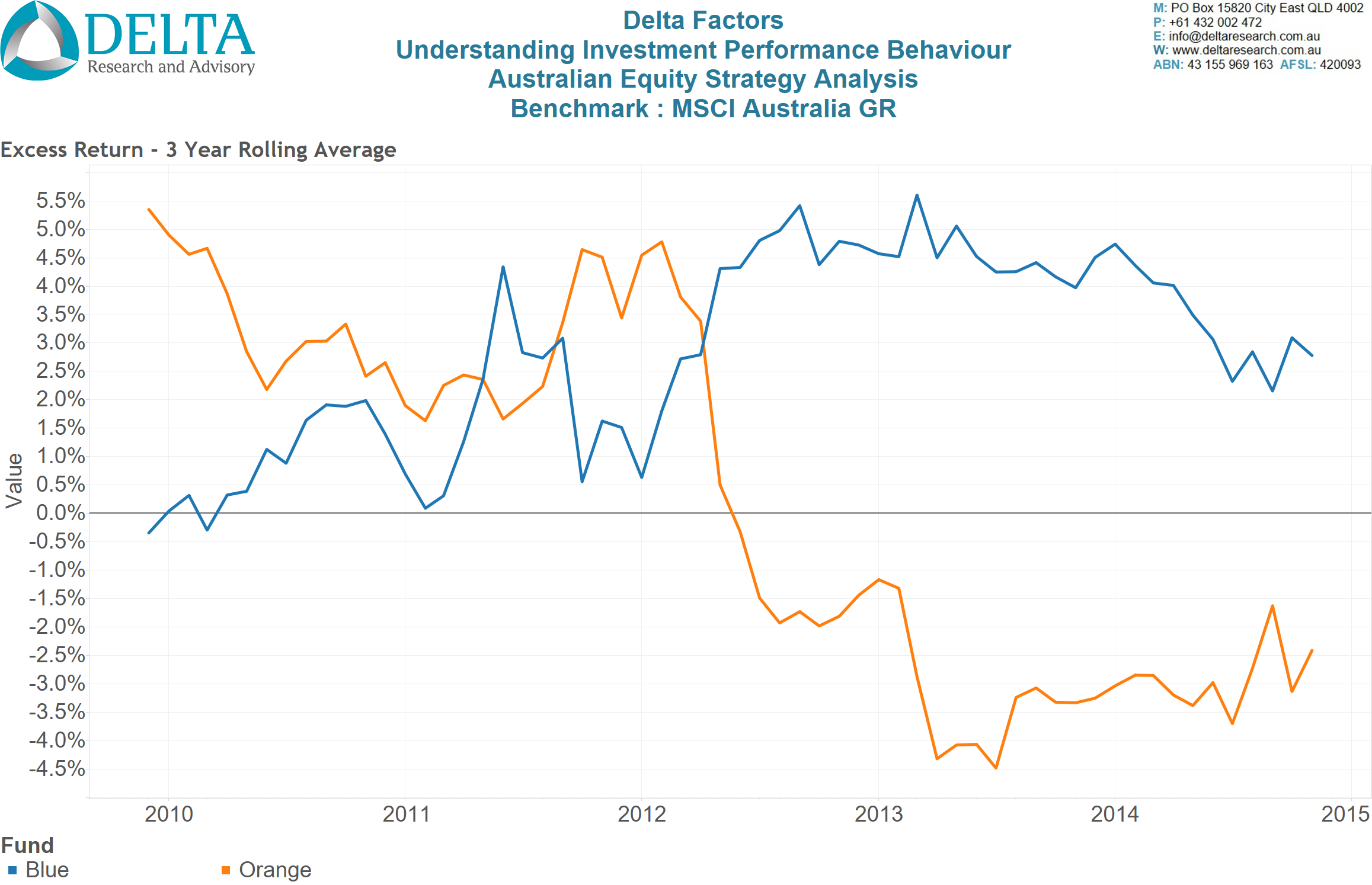
Source: Delta Research & Advisory
Moving on from Pure Performance – Adjusting for Market Risk
Risk-adjusted performance is frequently performed but rightly or wrongly it is rarely done on rolling timeframes and is usually performed across a single chosen time period. Unfortunately a single time period reduces a significant amount of information about investment performance behaviour so the risk-adjusted analysis performed here continues to to be time series based.
The Capital Asset Pricing Model
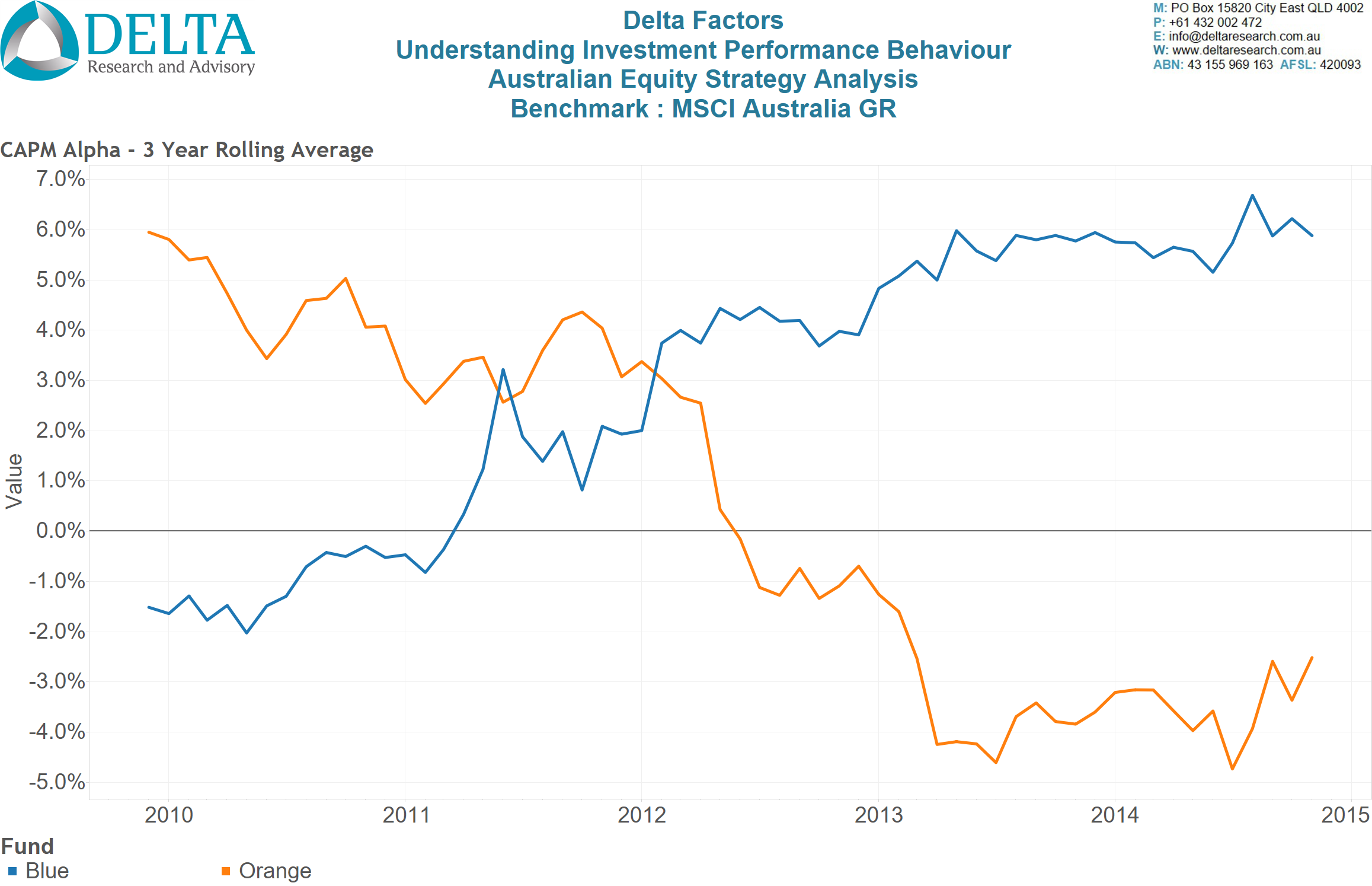
has a relatively poor reputation for predicting future returns. However, it is an excellent method for calculating exposure to the market (i.e. Beta) and risk-adjusted added value (i.e. Alpha). As we know, all active strategies aim to prove themselves with positive Alpha, which often doubles as the measure that defines “skill”. Using Capital Asset Pricing Model, performance analysis of both funds yields a market-risk-adjusted Alpha over rolling 3 year periods in Chart 4.
Chart 4 shows very different behaviours and potential signals for each fund. Firstly, their respective trends are in relative opposite directions, potentially suggesting opposite style.
The Blue fund has become negative in the earlier years, which wasn’t the case when analysing excess returns so there some currently unknown reasons for its market outperformance, as shown in Chart 3.
The Orange fund continues to show relatively poor results in the latter half of the timeframe, so its still looking like using this analysis many investors may have sold out of the Orange fund given this apparent weak performance.
Chart 4 – 3 Year Rolling Average (Annualised) – CAPM Alpha
Source: Delta Research & Advisory
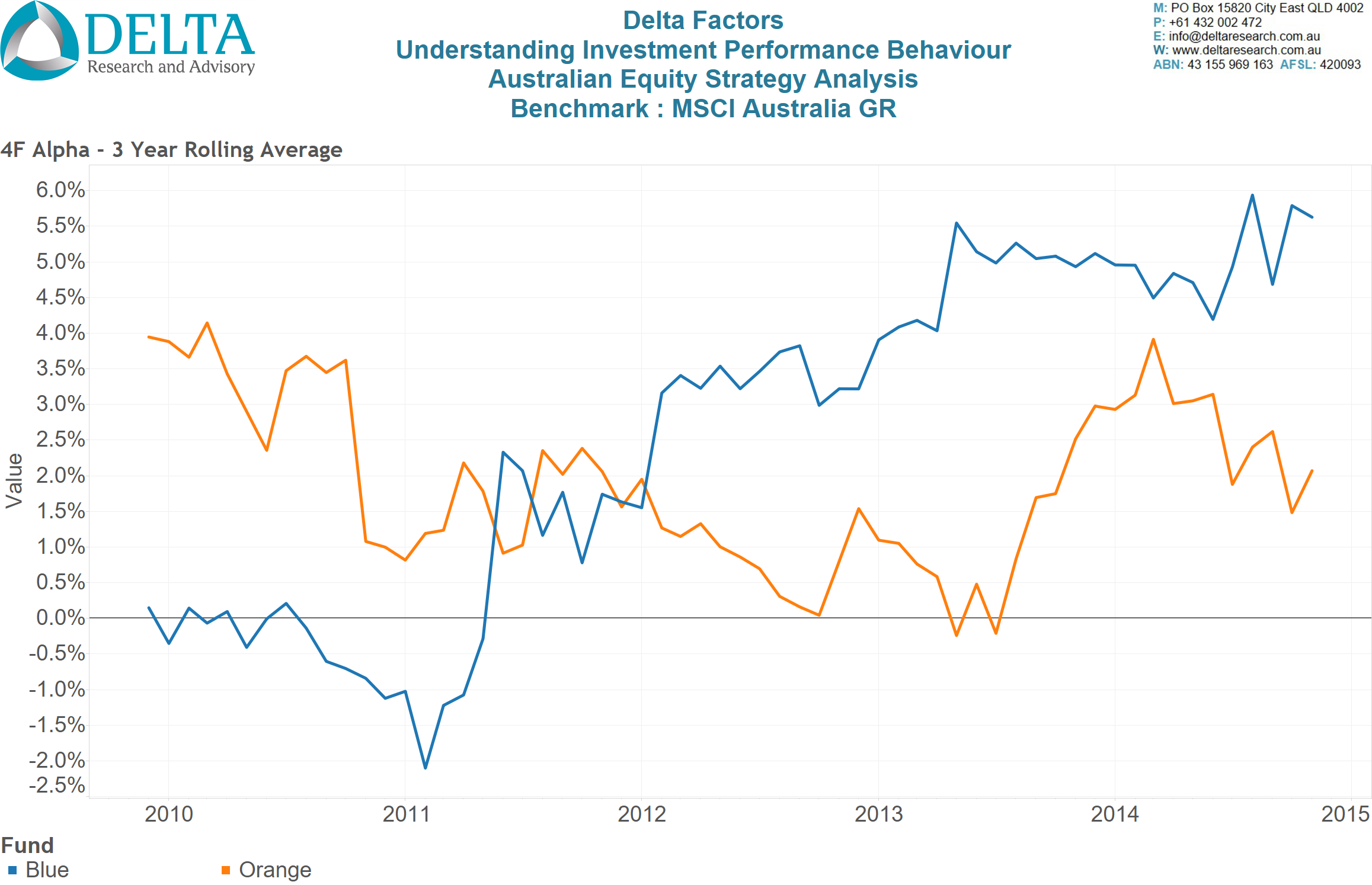
Adjusting for Style Risks
The final risk-based performance analysis takes the Capital Asset Pricing Model a step further and introduces other systematic risks into the mathematical model…this model is based on the multi-factor model sometimes called the Arbitrage Pricing Model.
Possibly the most well-known of the multi-factor models is the Fama-French 3 Factor model which adds two risk factors, value and size, to the single risk factor Capital Asset Pricing Model. For the purposes of this analysis, there are 3 additional risk factors which combine MSCI defined indices; Value minus Growth, Small Cap minus Large Cap, and a Momentum risk premium to MSCI Australia benchmark.
Chart 5 shows the Alpha that remains after adjusting for all four risk factors and we can see a dramatic change in result for the Orange Fund. It now has positive Alpha for almost all of the time period analysed, whereas the Blue Fund has a multi-year period of negative Alpha after adjusting for these multiple systematic risks. So whilst the Orange Fund produced underperformance compared to the market in the latter half (refer Chart 3 and/or 4) of this time period, after adjusting for common equity market risk factors, it’s added value (Alpha) is positive. This positive Alpha is what we would want to see from an active manager; positive value-add over and above potentially cheap and replicable systematic risks.
Chart 5 – 3 Year Rolling Average (Annualised) – Multi-Factor Alpha
Source: Delta Research & Advisory
How did this happen?
So introducing non-market systematic risks improved the Alpha of the Orange Fund and slightly reduced the Alpha of the Blue Fund…how did this happen? The answer is a logical one…one or more of the systematic risks had a significant contribution to the performance of the Orange Fund…and the answer is shown in Chart 6. These two funds have clear distinct styles…the Blue Fund is clearly a Value-style (which MSCI define as holding low PE, low Price/Book, and/or High Dividend securities) and the Orange Fund clearly has a Growth style (which MSCI define as holding stocks with high earnings growth, revenue growth, and internal growth).
So whilst a fund manager may define how they invest with respect to style, deeper performance analysis can show whether that fund does what it says (i.e. is true to label), or can uncover what other risk exposures may be driving good or bad performance. It is worth noting that some qualitative research reports do not specifically define the Orange Fund as a “Growth” fund but given the track record, and the definitions of Growth, it is difficult to argue with the performance analysis.
Chart 6 – 3 Year Rolling Average – Exposure to Value/Growth Factor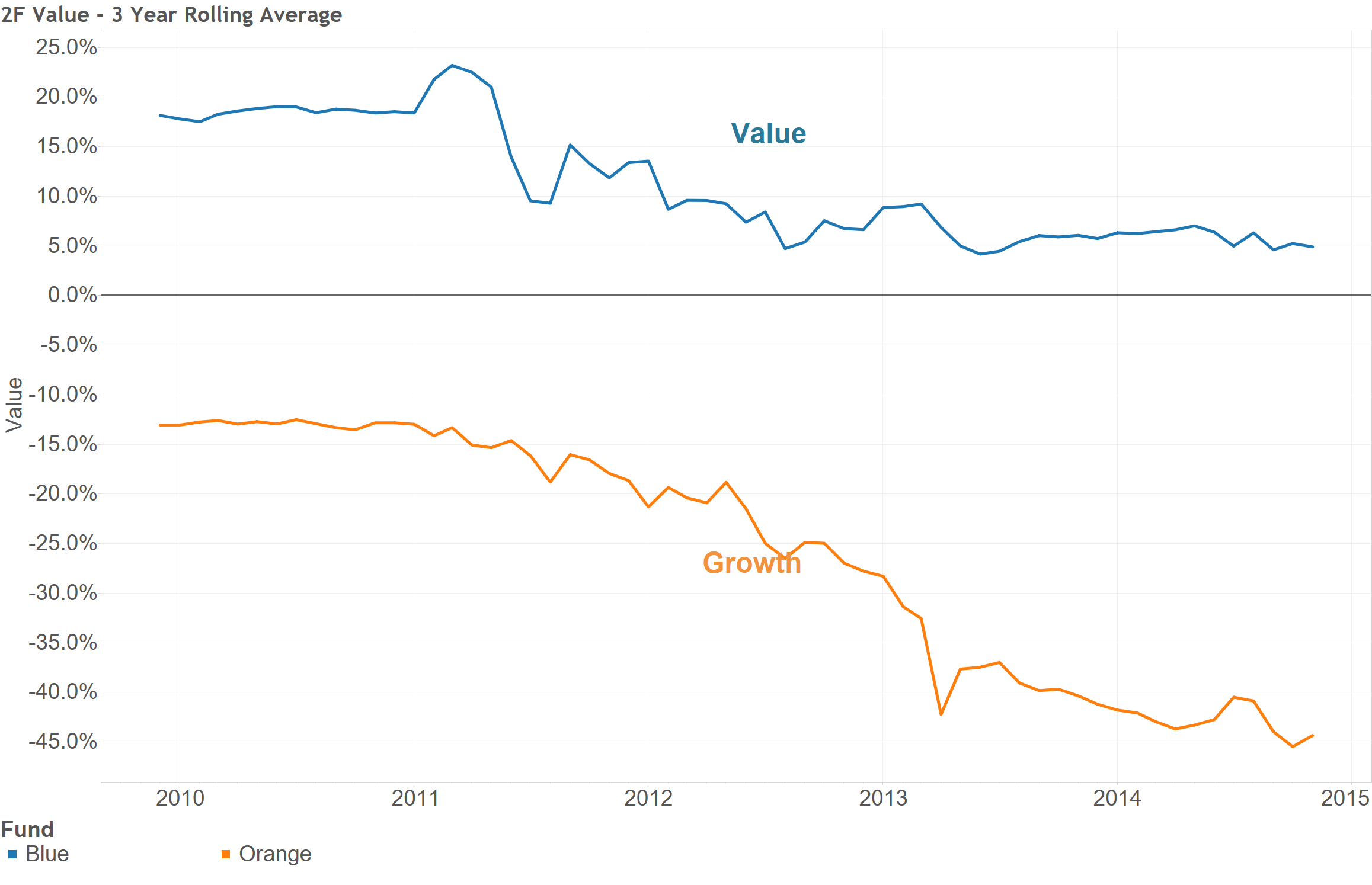
Source: Delta Research & Advisory
Conclusion
The process outlined above will differ from strategy to strategy and will depend on what is important with respect to the role of a potential strategy within a broader portfolio. However, hopefully what this process shows is the significant benefit in undertaking performance analysis that looks through the short term noise that all strategies incur and look for signals using longer timeframes.
To find the signal for constructing better investment portfolios also requires digging deeper into a strategy’s return series. It may involve adjusting performance for multiple risks, such as the market or styles (Value, Growth, Size, Momentum, Quality, Credit, Duration, etc.) whilst still increasing the time period of analysis. Moving away from quarterly or annual performance measures that dominate the industry and survey data is essential. Moving away from analysing performance over short time periods is a positive move that in aggregate will result in superior portfolio performance from lower transaction costs.