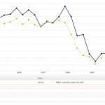
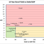
Chart 1 Source: Trading Economics The above chart shows the 10 year bond yield versus the Debt/GDP of the 10 largest countries in the world by GDP (Except Turkey whose bond data is missing). The chart is divided into 3 sections… Red section…countries with high 10 year bond yields Orange section…high debt levels but low …
Tag Archive: General Investment
Jun 27
Australian Equities Style Investing – Value vs Growth
Its been over a week since I posted so I thought I’d write about something that is a little bit different and hopefully may provide a little bit of food for thought. The above chart shows the performance of the MSCI Australia Value index (dominated by low PE stocks) vs MSCI Australia Growth index (dominated …
Jun 10
Infrastructure in an investment portfolio…diversification benefits?
Recent years has seen increased interest in infrastructure being included in investment portfolios. The justification goes that, infrastructure assets provide steady income streams linked to inflation from large, often monopoly assets (like toll roads, airports and the like), with long lifetimes that can reduce the capital volatility. As the following ten year chart shows, global infrastructure (represented …
May 18
Australian Government Bond Yields…continue record lows
Source: RBA In less than 2 weeks the Australian Government Bond yield curve has dropped another 20bps plus and since August last year, the yield curve has dropped around 160bps on average…which means for bond fund owners double digit returns over the previous 12 months continue. Obviously the main reason for this drop in yield …
Mar 27
Does our Super have too much in equities?
Over the last couple of weeks I’ve been asked to comment on the asset allocations of default super funds. There’s certainly been a very interesting debate through the print media which was probably started by David Murray, Chairman of the Future Fund, last year when he stated that Austrlaian Super Funds were too heavily invested …
Mar 20
Australian Government Bond Yields…approaching normal
Well…not normal yet. The shorter part of the curve suggests the market is expecting another two 25bps cuts by the RBA but with the Euro sovereign crisis well and truly looking much better its highly unlikely there’ll be any cuts soon. Whilst there’s plenty of evidence that shows the Euro sovereign crisis has improved, nothing …
Mar 10
SPIVA…Australian Small Cap managers demonstrate skill
The SPIVA report was released a few days ago and as I’ve mentioend before it is my favourite assessment of the success of fund managers because it takes into consideration survivorship bias…in other words, if you want to know who are the best fund managers over the last year, then you start with all fund …
Mar 06
Australian Bond Yields…still edging up
Source: RBA I know the above chart is a couple of days old but there’s not much change since last Thursday. At its simplest what it shows is that the bond market is still expecting the Reserve Bank to decrease interest rates some time during the year…with 1 year bond yields at less than 4%, …
Mar 04
Portfolio vs Asset Allocation…potential pitfalls
Many financial planners recommend their clients follow a particular Strategic Asset Allocation that may be based on the output of the combination of a risk profile as well as matching the client’s needs. For example, a popular strategic asset allocation for a “balanced” portfolio may be along the lines of… Australian Shares 35% Global Shares …


