Source: Trading Economics
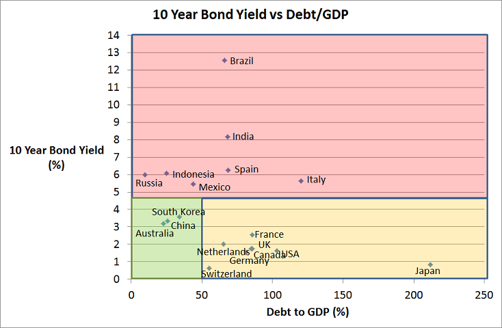
The above chart shows the 10 year bond yield versus the Debt/GDP of the 10 largest countries in the world by GDP (Except Turkey whose bond data is missing). The chart is divided into 3 sections…
- Red section…countries with high 10 year bond yields
- Orange section…high debt levels but low bond yields
- Green section…relatively low debt levels and bond yields
The countries in the red section are there because they have a history of default (e.g. Russia and Mexico) and there is probably an in-built credit risk associated with them; countries with currently high inflation (e.g. Brazil and India) and their bond yields are a reflection of this; and countries who are facing significant default risk (e.g. Spain and Italy). This is the red section because buying these sovereign bonds come with higher risk and potential instability.
The orange section does not show any strong signs of default risk which is really a result of their low interest rates which makes it relatively easy to sustain these debt levels indefinitely. The big risk for these countries are if interest rates start to climb. These countries are all facing deflationary issues, with Japan being there for many years already.
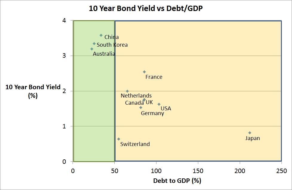
Finally the green section contains three countries that don’t pose too many risks at all from an investing perspective. Australia, China, and South Korea each have relatively low levels of debt but, interestingly, as Chart 2 shows they also have high interest rates than all countries in the orange section. Each of these three countries also appear to have the strongest economies.
Chart 2

Source: Trading Economics
The point I’m looking to make here, is that Australian bonds, despite their record low yields, do appear to be amongst the most attractive if not the most attractive place to allocate your safety capital. The yields are higher than most of the overseas safe havens plus this higher yield probably comes at the lowest levels of default risk.
Many superannuation and financial adviser portfolios have a significant allocation to Global Fixed Interest and the index exposure is popular. Unfortunately, the index construction of bond funds is deeply flawed and allocations are to those countries with the greatest amount of debt. The top 3 countries are USA, Japan and Italy….so what you get is low yields from US and Japan (and therefore significant interest rate risk), and high default risk from Italy.
Whilst most of this data is old news, it still makes a case, albeit simplistic, for an overweight position to Australian bonds in the defensive part of a sovereign bond portfolio.


